BFSG for Online Shops — What an Accessibility Audit Actually Finds
The BFSG has applied to B2C online shops since 28 June 2025. What an accessibility audit on a real headless Shopware storefront turned up, which fixes a developer can ship right away, which ones need design sign-off, and a checklist for your own shop.
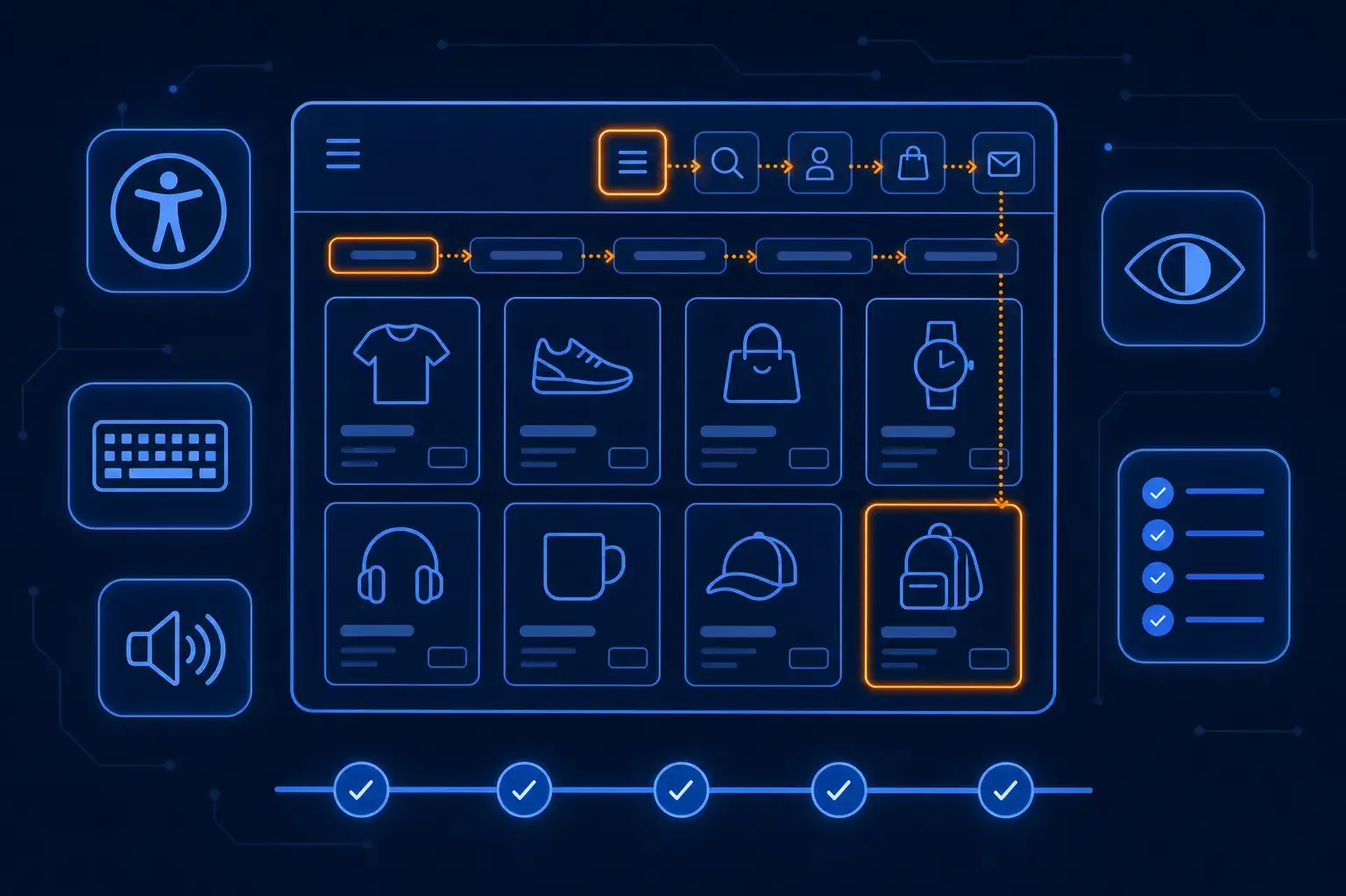
Since 28 June 2025, the Barrierefreiheitsstärkungsgesetz (BFSG) applies to online shops that sell to consumers in Germany. More than a year later, most of the shops I look at still fail the basics. They don't fail on exotic edge cases. They fail on things like a cart button a screen reader announces as "button", or a main menu you can't open without a mouse.
This post covers what an audit on a real storefront found, how I split the fixes, and what to check in your own shop. The examples come from a headless Shopware 6 + Nuxt storefront I work on, anonymized. The same defects show up in classic Twig storefronts too.
This is the developer's view, not legal advice. For your specific obligations, ask a lawyer.
Who the BFSG Applies To — The Short Version
- B2C e-commerce is in scope. If consumers can buy from your shop, the BFSG applies to your storefront, including the checkout and the customer account.
- Micro-enterprises are exempt for services. That means fewer than 10 employees and no more than €2 million in annual turnover or balance-sheet total. Many small shops fall under that line. Most of my clients don't.
- There is no grace period for a shop frontend. The often-quoted 2030 date is a transition rule for specific cases, not a free pass for your storefront.
- It's enforced. The federal states run a joint market surveillance authority, the MLBF, and fines go up to €100,000.
- You also have to publish information about how your service meets the accessibility requirements. Most shops do this in a dedicated page or their terms.
The technical target is the harmonised standard EN 301 549, which in practice means WCAG 2.1 level AA for web content. I audit against WCAG 2.2 AA. It's a superset, so you're covered when the standard catches up.
What the Audit Found
Nothing below is unusual. It's what almost every storefront I've audited has in common.
1. Icon-Only Buttons Without a Name
Menu, search, account, cart, newsletter: five icons in the header, and to a screen reader they were five unnamed buttons. A sighted user knows the bag icon is the cart. A screen reader user hears "button, button, button".
The fix is a translated aria-label per button, plus aria-expanded on the ones that open a panel:
<button :aria-label="$t('ariaLabels.openCart')" :aria-expanded="isCartOpen" @click="toggleCart">
  <IconCart aria-hidden="true" />
</button>
Two details matter. The icon gets aria-hidden="true" so it isn't announced on top of the label. And the label comes from the translation files, not a hardcoded string. Screen-reader text is copy like any other. That storefront ships ten locales, so every new key went into all ten. A key missing in one locale shows the raw key to customers, and that's a new defect introduced by an accessibility fix.
2. A Main Navigation You Can't Reach Without a Mouse
The desktop mega menu opened on hover. The top-level items were <div> elements with mouse handlers. Tab skipped straight past the entire navigation.
The fix: each top-level item became a real <button> with aria-expanded and aria-haspopup. It opens on click and on keyboard focus, and closes on Esc and when focus leaves the menu. That's the most common serious defect I find, and it's the one automated tools catch least reliably. The page looks fine, and a hover menu passes most scanners.
3. Focus Outlines Removed Everywhere
focus:outline-none sat on almost every interactive element, a leftover from someone who found the browser's default ring ugly. Keyboard users had no idea where they were on the page.
The fix was one global :focus-visible style and removing the bare outline-none from buttons and links. :focus-visible matters: it shows the ring for keyboard navigation but not on mouse click, so designers don't push back.
4. Modals and Sidebars That Leak Focus
The cart sidebar and the shared modal opened fine. But tabbing inside them moved focus to the page behind them, and Esc did nothing. A small useFocusTrap composable fixed both components at once: focus moves into the dialog on open, cycles inside it, Esc closes it, and focus returns to the button that opened it.
5. No Skip Link, No Main Landmark
Every page started with the full header and navigation, dozens of tab stops before the content. A skip link ("Skip to content") pointing at <main id="main"> fixes that. It's only visible when focused, so it doesn't change the design for mouse users.
6. Images and Embeds Without Text Alternatives
- Product images on one variant view had no
alt. The fix used the product name with a sensible fallback rather than a static string. - Decorative images need
alt="", not a missing attribute. A missingaltmakes screen readers read out the file name. - Embedded YouTube iframes had no
title. Every<iframe>needs one, otherwise it's announced as an unnamed frame.
7. ARIA Used Wrong
A role="link" on an element that already was a link, and a search field without role="search" on its container. Wrong ARIA is worse than none: it overrides what the browser would have announced correctly. My rule is to use the native element first and add ARIA only for state the element can't express.
8. Contrast on Brand Colours
Light text on a product card's coloured badge failed the 4.5:1 contrast ratio. This one isn't a developer fix. It's the brand palette, and changing it is a design decision.
How I Split the Fixes: Invisible vs. Visible
This split is the most useful part of my process, because it decides what ships this week and what needs a meeting.
Ship directly — the fix doesn't change what a sighted user sees:
aria-label,aria-expanded,aria-controls,aria-currentalttext,aria-hiddenon decorative iconstitleon iframes,langattributes- landmarks (
<main>,<nav>) replacing plain wrapper divs - removing positive
tabindexvalues
Report and get sign-off — the fix changes the rendered page:
- colour contrast and focus-ring styling
<div>→<button>conversions (they need CSS resets to keep the look)- heading levels (an
h2→h3usually changes the font size) - skip links (visible on focus, so they need a design)
- link copy like "Click here", touch-target sizes, carousels and autoplay
The first list is pure development work, and clients rarely question it. The second list goes to the client as a short document with a concrete proposal for each item. Mixing the two is how accessibility projects stall: a developer "just fixes" the contrast, the brand team reverts it, and nobody trusts the next change.
What Automated Tools Won't Tell You
Lighthouse and axe are a good start and catch real issues. They also give a hover-only mega menu a clean score. What they can't judge:
| Not checkable automatically | How to test it |
|---|---|
| Focus order | Tab through the page by hand |
| Focus visibility | Tab through on every background colour |
| Keyboard operability of custom widgets | Open every menu, modal, slider and filter by keyboard |
| Screen-reader announcements | VoiceOver (macOS/iOS) or NVDA (Windows) |
| Reflow at 320 px / 200 % zoom | Resize the browser, zoom in |
Dynamic state (aria-expanded updating) | Interact and listen |
A 100 accessibility score in Lighthouse is not a BFSG statement. I never write "compliant" in an audit report. I write what I checked, what I found, and what I couldn't verify.
A Note on Headless Shops
If you run the default Shopware storefront, Shopware has been working on accessibility in its Twig templates over the last releases, and you benefit from that with every update. A headless storefront gets none of it. Every header, menu, modal and form is your own code, so every defect above is yours too. That doesn't argue against headless. It means accessibility belongs in the headless budget from day one, not in a retrofit. (More on that budget in what a headless Shopware store really costs.)
Checklist for Your Shop
- Scope the critical path: home, category, product, search, cart, checkout, login, account, contact form.
- Run an automated scan (Lighthouse or axe DevTools) on each template. Fix the obvious findings.
- Do a keyboard-only pass: unplug the mouse and buy something. Every place you get stuck is a finding.
- Do a screen-reader pass on the same flow with VoiceOver or NVDA.
- Ship the invisible fixes straight away, with translations in every locale.
- Put the visible fixes on one list with proposals, and get design sign-off.
- Publish your accessibility information page.
- Keep it from regressing: check new and changed templates in code review, not once a year.
If you want a second pair of eyes on your storefront, I do exactly this kind of audit, with a prioritized fix list rather than a 200-page PDF. Get in touch.
Enjoyed this?
Get new posts as they land.
Keep reading

Making Your Website Readable for AI Agents — What Actually Matters
llms.txt, agents.md, ai-catalog.json, AI-bot rules in robots.txt. I shipped all of it on marcofaul.de, then audited it and found four of my own files broken or missing. What the 2026 data says about these files, what really decides whether AI tools can read your site, and a checklist to verify it.

531 Requests on a Homepage — Cutting a Headless Storefront Down to 101
A headless Shopware 6 + Nuxt storefront loaded 531 requests on its mobile homepage and scored 56 in Lighthouse. After one batch of changes on production it was 101 requests and 88. How I measured, where the weight came from, what I reverted, and a checklist for your own storefront.

Migrating a JTL-Shop to Shopify: What to Import and What to Skip
There is no one-click connector from JTL-Shop to Shopify. Here is how I planned a real migration - what I imported, what I deliberately did not, how scripts verify the result, how to stop notification mails during an order import, and the launch checklist.